
2026 / 05 / 09 Ernie Mota
A website is a road, not a brochure
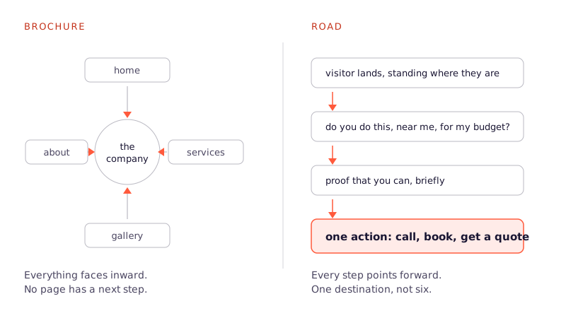
Most small-business websites are brochures: a homepage about the company, an about page about the company, a services page about the company. Everything faces inward.
The sites that actually win customers are built like roads. They start where the visitor is standing and lead, step by step, to one action: call, book, request a quote.
| Brochure site | Road site | |
|---|---|---|
| Organised around | The company: who we are, what we've done | The visitor: what they came to find out |
| Top of the homepage | Mission statement, hero video, awards | What you do, where, and the button |
| Each page ends with | Nothing, or six equal options | One obvious next step, named as a thing they get |
| Success looks like | Time on site | Clicks from landing to contacting you: one is great, two is fine |
| What gets cut | Nothing, it accumulates | Anything that does not move someone forward |
Every page needs a next step
A visitor finishing a page is at an intersection. If there is no signpost, they leave. Every page on your site should end with exactly one obvious next step, stated as something the visitor gets: "Get your free estimate," not "Submit."
One road, not six
When a page offers six equally weighted options, most people pick none. Decide the single action that matters most to your business and make it the biggest, clearest thing on every screen. Everything else is secondary by design.
Answer the question they arrived with
People land on your site with a question: do you do the thing I need, near me, for roughly what I can pay? The top of your homepage should answer that in one glance: what you do, where you do it, and the button to act. Awards, history and mission statements can live further down the road, for the people who want them.
Speed is part of the design
A beautiful site that loads in six seconds converts worse than a plain one that loads in one. Big hero videos and slider carousels are the usual culprits. Cut them, compress images, and treat every second of load time as customers walking away.
The test
Open your site, pretend you are your own customer, and count the clicks from landing to contacting you. One is great. Two is fine. If it takes three or more, or if any step makes you think, the road has a pothole. Fix that before spending a dollar driving traffic to it.